


New Cover, Who Dis?
- Sep 6, 2017
- 3 min read

Book covers are strange things. We all know the idiom how we shouldn’t judge the books by them, but we definitely do, no matter how much we insist otherwise. We’d like to think a beautiful butterfly resides within the ugly cocoon, but if the wrapping is tremendously terrible, we’re not going to stick around long enough to see what emerges to dazzle us.
What’s more, covers act as a type of code to the potential reader, letting them know what lies inside with a few choice images. Bookbub has spent some time discussing this, but we all inherently sort of know if we see a shirtless, strapping man on the cover we’re down for an Erotic romp, a spaceship and planet portends a Sci-Fi adventure, parasol and bonnet scores us a Historical Romance, while a guy and his gun some Thriller action.
Fantasy itself is littered with its own codes and clichés. Nicola over at Thoughts On Fantasy has already done a better job than I ever could parodying it, so I won’t bore you with my rendition (yet!). But you should definitely read her post so we’re all on the same page.
Why all this talk about fantasy cover clichés? Well, because for my first cover I decided I wanted exactly zero so as to stand apart from all the other cover clones. And you know what I’m talking about: Hooded man/ woman with sword, magical effect appearing out of one hand, probably some pointy ears, etc. So I made a conscious decision in insisting my original cover artist did not use any of them.
And I have to say, I really liked what she came up with. Problem was, no one else did. Believe me, I know, as in I have quantitative proof being as it’s been on Page Fights for months and only ever come out on top 33% of the time.

I believe a lot of the disconnect between me and any potential readers was that by eschewing any and all cover clichés, I inadvertently broke the Fantasy Cover Code; an unspoken set of things readers expect to see from a fantasy book.
So back to the drawing board I went, seeking out Amit Dutta over at Monkey Bread Art. He was suggested to me by someone active in the business, has a wonderfully haunted style I adore, and did that SPFBO finalist cover for Dead Letter I liked so much. And since I’m in SPFBO this year, I thought why the hell not?
I mean, after all his success in last year’s competition, Dyrk Ashton redid Paternus, citing how most people thought it was a YA book (perhaps with Harry Potter, Nathan Fillion and Zooey Deschanel stopping by (I kid because I love, Dyrk!)) because of the cover rather than a grimdark tale of gods at war it really was. Now no one can pretend to be ignorant of what’s going on inside it.
And let’s not ignore the 79 total covers Martin’s Game of Thrones has sported over the years, my favorite definitely being this one…

In this go I also didn’t make the mistake of giving the artist any directions, rather sending him all the info on the book and letting him get to work. And if you’ve been watching my Facebook, you’ve been seeing the results as we go along. Yeah, there’s some clichés there, but it’s gorgeous.
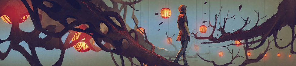
So, without further ado, I give to you The Woven Ring’s new cover.

Lovely, ain’t it? If by lovely you mean you should fear Marta, then it's everything I could have hoped for.
Anyways, with this new cover I can test my theory that it was my breaking of the Fantasy Cover Code what was holding me back all along. Will my theory prove correct?
Only time (and sales) will tell.


Comments